How I Got My Next.js Portfolio to Score 100% on Lighthouse Accessibility
A practical, honest account of everything I changed, why it matters, and how you can apply the same patterns to any animated React app.
A practical, honest account of everything I changed, why it matters, and how you can apply the same patterns to any animated React app.
I want to be upfront about something: before working on this, I thought my portfolio was accessible enough.
Until that day when I got a call for a job position requesting experience in Accessible web, and I personally had none specifically. And so I decided to really dig into it and learn the true fundamentals of it, and what's best to learn that put it at practice.
Back to my portfolio website, It had semantic HTML in most places as we always are told we should care about it. It kind ofmostly worked with a keyboard. It looked fine in a browser. The animations were as smooth as I could manage to get them. The design was deliberate.
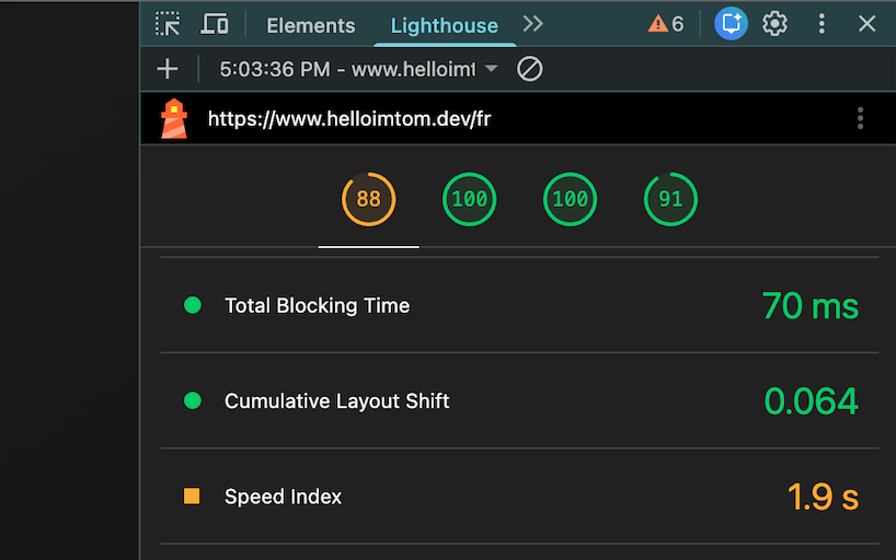
Then I ran an audit on Chrome's Lighthouse.
Accessibility: 74...
Not terrible. But not good. And for a site I was using to represent my work, that number felt like a contradiction. So I fixed it. Properly. All the way to 100.
This article documents everything I did, what the problems were, why they existed, and how I resolved each one. It's written for developers who already know how to build React and/or Next.js apps but want to understand what "accessible" actually means in a custom, animated, 3D-heavy React interface and not just a static marketing page.
What Lighthouse Is Actually Testing
Lighthouse doesn't test whether your site is practically usable by people with disabilities, that requires real user testing. What it does is audit a set of rules that are highly correlated with accessibility: correct semantics, sufficient contrast, proper ARIA usage, label associations, focus management, language declaration, and more.
Hitting 100 on Lighthouse is a strong foundation. It won't catch everything, but it does ensure your app isn't making obvious structural mistakes that trip up screen readers, keyboard users, or assistive technology in general.
The most important thing I learned: accessibility is not a list of fixes. It's a way of building.
The core Problems I Had
These are the issues that brought my score down and, more importantly, made the site genuinely hard to use for anyone who wasn't clicking with a mouse.
More Than One <main> Landmark
My layout had a <main> in the root layout, and another one inside a terminal surface that rendered the active stage. Screen readers use landmarks to navigate. Two <main> regions is ambiguous so, the user doesn't know which one contains the primary content.
Fix: One <main> per page, period. The terminal surface became a <section> instead.
Focus Drifted When the Stage Changed
This is the most common and most damaging accessibility bug in SPA-like interfaces.
When the user navigated from the hero section to the projects section, the visual content changed, but focus stayed on whatever triggered the navigation. Screen reader users were left talking to a ghost.
Fix: A dedicated useStageFocus hook that moves focus to the new stage container once the transition completes.
Here is the code for those who want to reuse it:
// hooks/useStageFocus.ts

import { useEffect, useRef } from "react";

export function useStageFocus(activeStage: string) {
  const containerRef = useRef<HTMLElement>(null);

  useEffect(() => {
    const timeout = setTimeout(() => {
      containerRef.current?.focus({ preventScroll: true });
    }, 300); // wait for transition

    return () => clearTimeout(timeout);
  }, [activeStage]);

  return containerRef;
}
Then in the terminal/stage container:
const stageRef = useStageFocus(activeStage);

<section
  ref={stageRef}
  tabIndex={-1} // makes it programmatically focusable without adding to tab order
  id="stage-content"
>
  {/* stage content */}
</section>;
tabIndex= is the key here , as it makes the element focusable via .focus() in JavaScript without inserting it into the natural Tab order. This is exactly right for focus management targets.
Custom Terminal UI Without Semantic Structure
The terminal surface looked great but communicated nothing to assistive technology. No headings. No regions. No labels.
Fix: Each stage got a semantic wrapper and a heading, either visible (hero) or hidden with sr-only (other stages).
const stageContentHeadingId = `stage-content-heading-${stage}`;

<section aria-labelledby={stageContentHeadingId}>
  {stage !== "hero" && (
    <h2 id={stageContentHeadingId} className="sr-only">
      {stageLabel} {/* e.g. "Projects", "About", "Contact" */}
    </h2>
  )}
  {/* content */}
</section>;
The sr-only class hides the heading visually while keeping it in the accessibility tree:
.sr-only {
  position: absolute;
  width: 1px;
  height: 1px;
  padding: 0;
  margin: -1px;
  overflow: hidden;
  clip: rect(0, 0, 0, 0);
  white-space: nowrap;
  border-width: 0;
}
Decorative Three.js Scenes and Glows in the Accessibility Tree
Every <canvas>, glow wrapper, orbit ring, and decorative <div> was discoverable by screen readers. This polluted the tree with noise.
Fix: aria-hidden="true" on every decorative wrapper. alt="" on every decorative image.
{
  /* Three.js canvas wrapper — purely visual */
}
<div aria-hidden="true" className="absolute inset-0 pointer-events-none">
  <canvas ref={canvasRef} />
</div>;

{
  /* Decorative image */
}
<Image src="/grain.png" alt="" aria-hidden="true" />;
This alone can significantly clean up what a screen reader user encounters.
Contact Form With No Real Labels
The form had pretty (according to me, ...) styled terminal-style prompts that looked like labels but weren't connected to the inputs in any programmatic way. Placeholders were doing double duty.
Fix: Proper <label> with htmlFor, id, name, required, autoComplete, inputMode, aria-invalid, aria-describedby, and role="alert" on inline errors.
<label htmlFor="contact-email">
  <span className="text-primary text-xs">❯ email --address</span>
</label>

<input
  id="contact-email"
  name="email"
  type="email"
  autoComplete="email"
  inputMode="email"
  required
  aria-invalid={fieldErrors.email ? "true" : "false"}
  aria-describedby={fieldErrors.email ? "contact-email-error" : undefined}
/>

{fieldErrors.email && (
  <p id="contact-email-error" role="alert" className="text-xs text-red-300 mt-1">
    {fieldErrors.email}
  </p>
)}
Two things worth calling out here:
inputMode="email" is separate from type="email". The type controls browser validation. The inputMode tells mobile operating systems which soft keyboard to show, the one with @ and .com visible. A small detail that matters for mobile UX.
role="alert" makes the error announce itself immediately to screen readers without requiring focus to move to it. Combined with aria-describedby, the field and its error are programmatically linked.
Form-level feedback (submission success/failure) uses aria-live="polite" instead, so it announces without interrupting:
<div role="status" aria-live="polite" className="sr-only">{submitMessage}</div>Focus Rings Showing During Mouse/Touch Interaction
Focus rings are essential for keyboard users. They're also visually distracting for pointer users, and most design systems either kill them entirely (bad) or let them show everywhere (annoying).
Fix: Track input modality on the <html> element and conditionally style focus rings.
// In a top-level client component

useEffect(() => {
  const onKeyDown = () =>
    document.documentElement.setAttribute("data-input-modality", "keyboard");
  const onPointerDown = () =>
    document.documentElement.setAttribute("data-input-modality", "pointer");

  window.addEventListener("keydown", onKeyDown);
  window.addEventListener("pointerdown", onPointerDown);

  return () => {
    window.removeEventListener("keydown", onKeyDown);
    window.removeEventListener("pointerdown", onPointerDown);
  };
}, []);
/* globals.css */

.keyboard-focus-ring:focus {
  outline: none;
}

[data-input-modality="keyboard"] .keyboard-focus-ring:focus {
  outline: 2px solid var(--color-primary);
  outline-offset: 3px;
  border-radius: 3px;
}
Every interactive element gets className="keyboard-focus-ring". This means keyboard users always see where they are. Pointer users never see a ring appear on click. Both groups get the experience they expect.
Icon-Only Buttons With No Accessible Name
My theme toggle, motion toggle, back-to-top button, and mobile nav arrows all had icons but no text. Screen readers announced them as "button"completely useless sinc eit doesn't tell what this button does, only what it is.
Fix: aria-label on every icon-only control. aria-hidden="true" on the icon inside. aria-pressed on toggles.
{
  /* Theme toggle */
}
<button
  type="button"
  onClick={toggleTheme}
  aria-pressed={isDark}
  aria-label={isDark ? "Switch to light mode" : "Switch to dark mode"}
  className="keyboard-focus-ring"
>
  <Sun aria-hidden="true" size={15} />
</button>;

{
  /* Mobile nav */
}
<button
  onClick={goToNext}
  disabled={!canGoDown || isMorphing}
  aria-label="Next section"
  className="keyboard-focus-ring"
>
  <svg aria-hidden="true">...</svg>
</button>;
The aria-label is dynamic - it always describes what will happen, not the current state. "Switch to light mode" tells the user the action. aria-pressed= tells them the current state. Together, they give a complete picture.
disabled is also doing accessibility work here: it prevents activation during transitions and is announced as unavailable by screen readers.
Mobile Menu Interaction Bugs
The mobile menu opened visually but became non-interactive in certain states because inert was applied to the wrong subtree. There was also a z-index issue where the fixed top nav intercepted taps on the close button area.
Fix: The menu is now treated as a dialog-like surface with full semantics:
<div
  role="dialog"
  aria-modal="true"
  aria-label="Navigation menu"
  id="mobile-menu"
>
  {/* menu content */}
</div>

<button
  aria-expanded={isMenuOpen}
  aria-controls="mobile-menu"
  aria-label={isMenuOpen ? "Close menu" : "Open menu"}
  className="keyboard-focus-ring"
>
  {/* icon */}
</button>
When the menu opens: focus moves inside. When it closes: focus returns to the toggle. Body scroll is locked. The top nav gets pointer-events-none so it doesn't intercept the close button.
Portfolio Hidden Panels Still Accessible
The project panels used CSS to hide inactive slides, but they remained in the tab order and the accessibility tree. A keyboard user could Tab into an invisible panel.
Fix: Inactive panels get aria-hidden="true" and inert. Active panel has neither.
<div
  aria-hidden={!isActive}
  inert={!isActive ? "" : undefined}
  className={`panel ${isActive ? "active" : ""}`}
>
  {/* project content */}
</div>
The inert attribute is now well-supported and is the cleanest way to completely remove a subtree from both the accessibility tree and keyboard interaction simultaneously.
No lang Attribute on <html>
This is a WCAG Level A requirement. Without it, screen readers use their default language engine, which may mispronounce content in French or Spanish.
In app/[locale]/layout.tsxor the root layout depending on your projec architecture:
export default function LocaleLayout({
  children,
  params,
}: {
  children: React.ReactNode;
  params: { locale: string };
}) {
  return (
    <html lang={params.locale}>
      <body>{children}</body>
    </html>
  );
}
One line. WCAG 3.1.1. Always set it.
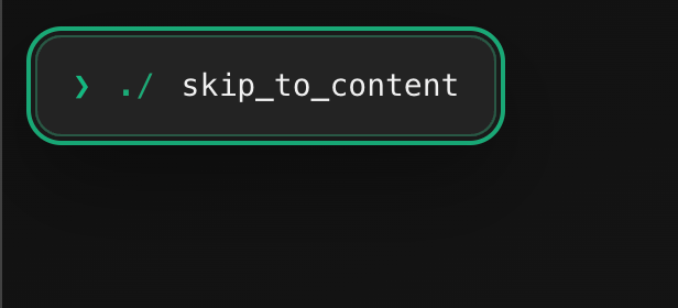
The Skip Link
Keyboard users need a way to bypass repeated navigation and jump directly to the main content. This is what a skip link does.
// components/ui/SkipLink.tsx
"use client";

export function SkipLink({ targetId }: { targetId: string }) {
  const handleClick = (e: React.MouseEvent<HTMLAnchorElement>) => {
    e.preventDefault();
    const target = document.getElementById(targetId);
    if (target) {
      target.focus({ preventScroll: true });
      target.scrollIntoView({ behavior: "smooth", block: "start" });
    }
  };

  return (
    <a
      href={`#${targetId}`}
      onClick={handleClick}
      className="
        sr-only focus:not-sr-only
        fixed top-4 left-4 z-[9999]
        px-4 py-2 rounded
        bg-background text-foreground
        border border-primary
        text-sm font-medium
        keyboard-focus-ring
      "
    >
      Skip to content
    </a>
  );
}
The key detail: it prevents default so it doesn't write #stage-content into the URL bar. It focuses programmatically instead. Same behavior, cleaner URL.
Used in app/[locale]/layout.tsx:
<SkipLink targetId="stage-content" />
<Navbar />
<main id="main-content">
  <section id="stage-content" tabIndex={-1}>
    {children}
  </section>
</main>
Reduced Motion: A Full System, Not a Media Query
My app has typing animations, cursor blinking, terminal morphs, 3D floating scenes, and panel transitions. Without a motion preference system, this is genuinely rough for people with vestibular sensitivities.
The system has three layers:
- System preference: prefers-reduced-motion is respected by default.
- App override: a visible toggle lets users flip the preference without going to OS settings.
- Persistent choice: stored in localStorage so the preference survives page reloads.
In short, I make heavy animations and transitions optional, more or less.
// contexts/MotionPreferenceContext.tsx
"use client";

import { createContext, useContext, useEffect, useState } from "react";

type MotionPreference = "full" | "reduced";

const MotionPreferenceContext = createContext<{
  preference: MotionPreference;
  toggle: () => void;
}>({
  preference: "full",
  toggle: () => {},
});

export function MotionPreferenceProvider({ children }: { children: React.ReactNode }) {
  const [preference, setPreference] = useState<MotionPreference>("full");

  useEffect(() => {
    const stored = localStorage.getItem("motion-preference");
    if (stored === "reduced" || stored === "full") {
      setPreference(stored);
    } else {
      const systemReduced = window.matchMedia("(prefers-reduced-motion: reduce)").matches;
      setPreference(systemReduced ? "reduced" : "full");
    }
  }, []);

  const toggle = () => {
    setPreference((prev) => {
      const next = prev === "full" ? "reduced" : "full";
      localStorage.setItem("motion-preference", next);
      return next;
    });
  };

  return (
    <MotionPreferenceContext.Provider value={{ preference, toggle }}>
      {children}
    </MotionPreferenceContext.Provider>
  );
}

export const useMotionPreference = () => useContext(MotionPreferenceContext);
In animation code:
const { preference } = useMotionPreference();
const isReduced = preference === "reduced";

gsap.to(element, {
  duration: isReduced ? 0 : 0.6,
  y: isReduced ? 0 : -20,
  opacity: 1,
});
Reduced mode is not "kill all motion." It's a calmer language: shorter durations, more fades instead of spatial movement, instant typing, static 3D. beacuse the idea wasn't to kill the polish transitions style I wanted to convey but rather to soften things.
Touch Targets: 44px Minimum
WCAG 2.5.5 (and Apple's Human Interface Guidelines) both set 44px as the minimum touch target size. A nav button that looks large can still have a smaller actual interactive area.
@media (max-width: 767px) {
  nav button,
  nav a,
  form button {
    min-height: 44px;
    min-width: 44px;
  }
}
Also worth adding for mobile swipe navigation:
body {
  overscroll-behavior: none; /* prevents iOS rubber-band interfering with swipe */
}

.terminal-surface {
  user-select: none; /* prevents accidental text selection during swipe */
}

.terminal-surface input,
.terminal-surface textarea {
  user-select: text; /* re-enable for form fields */
}
aria-current on Navigation
This one is simple but often missed. Desktop nav items should expose which section is active:
<a
  href={`/${locale}/${stagePath}`}
  aria-current={isActive ? "page" : undefined}
  className="keyboard-focus-ring"
>
  {label}
</a>
Screen readers announce "Projects, current page" instead of just "Projects". One attribute, big difference.
A Practical Testing Checklist
Run this before shipping any significant UI change.
Keyboard
- Can the entire flow be completed with keyboard alone?
- Is Tab order logical top-to-bottom, left-to-right?
- Is focus always visible when in keyboard mode?
- Does focus not appear during pointer interaction?
- After stage/panel changes, does focus land in the new section?
Screen Reader & Semantics
- Exactly one
<main>per page? - Every major section has a heading or aria-label?
- Decorative layers are aria-hidden="true"?
- Icon-only buttons have aria-label?
- Toggle buttons use aria-pressed?
<html lang>is set to the correct locale?- Skip link present and functional?
Forms
- Every field has a
<label>with htmlFor? - id and name present on all inputs?
- Required fields marked with required?
- Error messages linked via aria-describedby?
- Submit feedback exposed via aria-live?
Motion
- System prefers-reduced-motion is respected?
- User override toggle works and persists?
- Reduced mode still communicates transitions clearly?
- Looping decorative animations are removed or frozen in reduced mode?
Mobile
- Touch targets ≥ 44px on mobile?
- Swipe navigation doesn't cause accidental text selection?
- Mobile menu opens, closes, and handles focus correctly?
- Position indicators are aria-hidden="true"?
Hidden Panels / Portfolio
- Hidden panels are aria-hidden="true" and inert?
- Active panel gets focus after navigation?
- CTA zones are pinned structurally, not relying on accidental spacing?
What I'd Tell My Past Self
Accessibility is not an audit you run at the end. It's not a checklist you tick once. It's a set of building habits that, once internalized, cost almost nothing extra per component.
The patterns I used: useStageFocus, modality tracking, aria-hidden on decorative layers, real labels on form fields, aria-pressed on toggles, ... none of them are complicated. Most take five minutes to implement correctly, especially with AI. They just require knowing they exist and above all that they're needed hy more than we may think.
The bigger mindset shift is this: every time you build a new interactive element, the first question isn't "how does this look?" It's "what is this, can it be focused, is it decorative, and if its state changes , who knows about it?"
If you can answer those four questions for every UI element you build, you'll stay at 100.
Resources you can also check:
- WCAG 2.2 Quick Reference
- WebAIM Contrast Checker
- axe DevTools Chrome Extension
- MDN: ARIA Authoring Practices
- The inert attribute - MDN
And of course my previous articles:
Aussi publié sur Medium